Wednesday, March 17, 2010

Katherine Westerhout

This is another photographer that was shown. Her type of photography is old abandoned places. Not many people pay attention to or give concern to the old buildings other than people tagging it with spray paint or damaging it even more. Westerhout really gives attention to the old abandoned buildings. She thinks that the light totally differs from a new still in use building. I think the light really reflects the old decaying wall. It gives it really good natural old look to it. Her photos tend to be clean instead of a lot of mess around it which enhances the picture.

There are a few differences on Westerhout and Burtynskys style of art. Burtynsky tends to add trash or add mess to make his art look good. Westerhout tends to keep it clean so that nothing is interfering or disturbing the clean picture. Both photographic styles are really unique but are also really good. I lean more towards the one with trash because you can move around the trash to make look a certain way. With Westerhout you have to wait for the right time to take the picture and the right type of lighting. But when timed perfect the picture can look really good.


Edward Burtynsky

The video we say today was a quite interesting type of art. The first chapter I saw was some sort of trash sorting. I thought they were just rummaging through the trash trying to find something that they lost but really they were just trying to organize the trash to create some form of art. It was kind of cool to see how multiple people organize trash and to see the finished piece looked great. The Chinese people would break old electronics and use it for there own houses or something else. So this really fits the quote, "A persons trash is another persons treasure." I started to think about that quote when I saw the trash art and certainly indeed it turned into treasure.

The second part we saw was the Bangladesh people dismantling old ships. I first thought they were going to use the ones they were tearing apart as art but really it was the ones that were left standing was art. And now that is a lot work and precision thinking to do because everything can fall if it is not done correctly. It was cool to see the standing pieces. This was the first time I had seen this type of art. It was beautiful to see the finished pieces. There was one piece that had the dog's head and I thought that was pretty cool.

Poster #3

This is my poster number three. I decided to use one of my altered book pages from the workshop. I added a few things in it and added a typographic frame to make the poster look better, more of a grunge feel to it.


Online Artist #3: Jerico Santander

My third online artist is Jerico Santander. He does photo manipulation art. I found that photo manipulation can be very open to any type of design. I have seen some of his work and it is really clean. He likes to take different things from other objects and put into the main object. He mainly does people as his main object and he puts in different things like a machine or different types of objects. I find most of his work is somewhat dramatic. It is either dark colored picture or a sad looking one. When I look at his work. One of my favorite works from his website is the one with the man opening a shirt and a water fall is put onto his chest. I thought that was a cool effect. It was also clean because it looked like the person actually came out of the water. Then inside his chest is suppose to be the background but that one is really focused as oppose to the background outside his body.

I can relate to this artist very well. I like to change the photo around and manipulate them. I do it in a more of a comedic approach. I like to cut people out in other pictures and put them all in one picture. I think it is an interesting approach because you can trick a lot of people if it is done well.

http://www.behance.net/Jerico

Tuesday, March 16, 2010

Online Artist #2: Tyler Askew

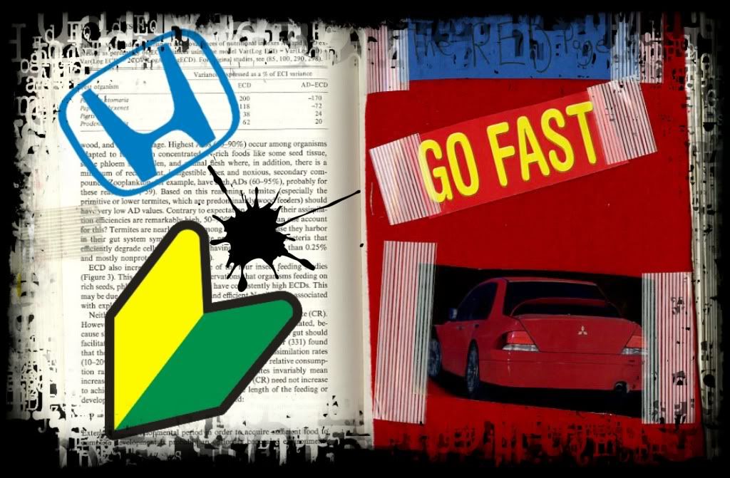
Tyler Askew is a professional graphic designer. I have looked at his work and I think it is similar to the work that we do taking a picture and altering it with different designs. How Askew's work relates to mine is that I like to take pictures of people and alter it. I like to go into Photoshop and add textures and words in the picture to make it feel better. Some of his work is really simple but yet is very well done. If you put too much into a picture then it will be confusing. Tyler Askew does not do that. He takes a few textures and tries to connect it with the picture so that it will make sense and not be messy. I saw that a few of his works had grunge and that is something I like to work on. Most of the grunge is very interesting to me and when done right it can be a beautiful piece.

What inspires me about his work is his ability to keep it simple. When I do a graphic design piece, I always think "Less is more," as that is always true. Too much and the work can turn into disaster. His work is what I want to do in the future. He also works with typography which is also one of my favorite things to work on. I feel that typography art can be really strong even if you put one word on a piece of artwork.

Tyler Askew


Pictures from www.tyleraskew.com/

Wednesday, March 10, 2010

A few pages from my book.

Here are a few pages from my book. My books is going to be about manipulating sports pictures and adding other objects, people or anything else in my book.

Here are a few examples of what I am talking about:


Wednesday, March 3, 2010

Poster #2

I first manipulated this photo then I printed it out and did some stuff to it like scratch it, draw smudges on it and cut corners to make it look old. And then I scanned it into photoshop and used the dodge tool to give it an older from the 80's photo.

Poster #1

This is my poster number one. I made a composite picture and added a few things to it. As well as also adding some scanned stuff from my altered book that I made.