This is my final book. The title of the book is Sports and Design. I used both the sports pictures and designed them to make them look like an advertisement or an article in a magazine.
Wednesday, April 28, 2010
Online Artist #5: Bruce Mau
Another design aspect that inspires me is typography. Not many people pay attention to typography and notice how important it is to one person's art work. Typography is something that can make a difference in ones work. An artist that I saw and studied that had good typography work is Bruce Mau. He has his own company. I checked out his typography work and it is very concise with his over all work. If his design is very serious and so is his typography. The typography greatly matched his design work. If his work was playful then his typography will be playful. I just find the need to have great typography to have great work because without great typography it can throw off a persons thoughts about his or her work.
How I can relate to this person is that I too like to do typography work but I also truly believe that it does make a difference in ones work. I have to take in consideration of matching my typography work to my design aspect especially when I am doing a website design. I want it to match with the page or I want it to have to do something with the content I put into it. Overall I am very pleased with his work because it is clean and it matches to what he is designing.
www.brucemaudesign.com (Bruce Mau Website)

Online Artist #4: Chip Kidd
I viewed this artist work and I found a lot of elements that I liked. First off he is a graphic designer. He does a lot of advertising design. This is something that I am interested in doing later on in life. Kidd's designs are very clean and it has some sort of message to it. I have looked at his recent works and I found a few works that inspired me even more to work harder. Like for example I looked at the superman design he did. The title of it was Rough Justice. I thought looked interesting because there was fading color. Maybe that could be the rough part of the design and the justice could be the part where superman is throwing a punch at something. Therefore in the end Rough Justice made sense to me as the title of the magazine cover. Most of his work is something I would like to do in the future.
His work inspired me to be more of an advertising designer. I liked most of his work because not only did he do his for advertising purposes; there are also hidden messages in his work. So he is forcing us to look deeper into his work and find out what the message is. His work is also very clean and that is something that I am lacking. Looking at Kidd’s work makes me think twice about submitting something before looking at a final time and think what else should I do or what errors do I see.
http://www.goodisdead.com/ (Chip Kidd's Website)

Alex Ingram Presentation
Alex Ingram came into our class to present how he got into art graduate school. And he was very inspirational in his talk. I found a lot of information that he gave to us. What I liked the most is that he gave a lot of information about the process of how to get into graduate school. Getting into graduate school is a very long process and is very rewarding if you get in. He got in to Pratt College which is one of the top art schools in America. His website that he showed us was very interesting and simple. He has good work up there for other people to see. What I got from him is that blogging is important. I thought this was important because so then people are going to see what are you up to currently in your work. So then after his talk I created a blog of my own and started tracking my work. He truly inspired me to start a blog and keeping track of what is going on. You never know who is going to look at your blog.
Wednesday, March 17, 2010
Katherine Westerhout
This is another photographer that was shown. Her type of photography is old abandoned places. Not many people pay attention to or give concern to the old buildings other than people tagging it with spray paint or damaging it even more. Westerhout really gives attention to the old abandoned buildings. She thinks that the light totally differs from a new still in use building. I think the light really reflects the old decaying wall. It gives it really good natural old look to it. Her photos tend to be clean instead of a lot of mess around it which enhances the picture.
There are a few differences on Westerhout and Burtynskys style of art. Burtynsky tends to add trash or add mess to make his art look good. Westerhout tends to keep it clean so that nothing is interfering or disturbing the clean picture. Both photographic styles are really unique but are also really good. I lean more towards the one with trash because you can move around the trash to make look a certain way. With Westerhout you have to wait for the right time to take the picture and the right type of lighting. But when timed perfect the picture can look really good.


There are a few differences on Westerhout and Burtynskys style of art. Burtynsky tends to add trash or add mess to make his art look good. Westerhout tends to keep it clean so that nothing is interfering or disturbing the clean picture. Both photographic styles are really unique but are also really good. I lean more towards the one with trash because you can move around the trash to make look a certain way. With Westerhout you have to wait for the right time to take the picture and the right type of lighting. But when timed perfect the picture can look really good.


Edward Burtynsky
The video we say today was a quite interesting type of art. The first chapter I saw was some sort of trash sorting. I thought they were just rummaging through the trash trying to find something that they lost but really they were just trying to organize the trash to create some form of art. It was kind of cool to see how multiple people organize trash and to see the finished piece looked great. The Chinese people would break old electronics and use it for there own houses or something else. So this really fits the quote, "A persons trash is another persons treasure." I started to think about that quote when I saw the trash art and certainly indeed it turned into treasure.
The second part we saw was the Bangladesh people dismantling old ships. I first thought they were going to use the ones they were tearing apart as art but really it was the ones that were left standing was art. And now that is a lot work and precision thinking to do because everything can fall if it is not done correctly. It was cool to see the standing pieces. This was the first time I had seen this type of art. It was beautiful to see the finished pieces. There was one piece that had the dog's head and I thought that was pretty cool.
The second part we saw was the Bangladesh people dismantling old ships. I first thought they were going to use the ones they were tearing apart as art but really it was the ones that were left standing was art. And now that is a lot work and precision thinking to do because everything can fall if it is not done correctly. It was cool to see the standing pieces. This was the first time I had seen this type of art. It was beautiful to see the finished pieces. There was one piece that had the dog's head and I thought that was pretty cool.
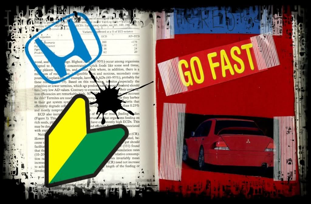
Poster #3
This is my poster number three. I decided to use one of my altered book pages from the workshop. I added a few things in it and added a typographic frame to make the poster look better, more of a grunge feel to it.

Subscribe to:
Comments (Atom)