This is my final book. The title of the book is Sports and Design. I used both the sports pictures and designed them to make them look like an advertisement or an article in a magazine.
Wednesday, April 28, 2010
Online Artist #5: Bruce Mau
Another design aspect that inspires me is typography. Not many people pay attention to typography and notice how important it is to one person's art work. Typography is something that can make a difference in ones work. An artist that I saw and studied that had good typography work is Bruce Mau. He has his own company. I checked out his typography work and it is very concise with his over all work. If his design is very serious and so is his typography. The typography greatly matched his design work. If his work was playful then his typography will be playful. I just find the need to have great typography to have great work because without great typography it can throw off a persons thoughts about his or her work.
How I can relate to this person is that I too like to do typography work but I also truly believe that it does make a difference in ones work. I have to take in consideration of matching my typography work to my design aspect especially when I am doing a website design. I want it to match with the page or I want it to have to do something with the content I put into it. Overall I am very pleased with his work because it is clean and it matches to what he is designing.
www.brucemaudesign.com (Bruce Mau Website)

Online Artist #4: Chip Kidd
I viewed this artist work and I found a lot of elements that I liked. First off he is a graphic designer. He does a lot of advertising design. This is something that I am interested in doing later on in life. Kidd's designs are very clean and it has some sort of message to it. I have looked at his recent works and I found a few works that inspired me even more to work harder. Like for example I looked at the superman design he did. The title of it was Rough Justice. I thought looked interesting because there was fading color. Maybe that could be the rough part of the design and the justice could be the part where superman is throwing a punch at something. Therefore in the end Rough Justice made sense to me as the title of the magazine cover. Most of his work is something I would like to do in the future.
His work inspired me to be more of an advertising designer. I liked most of his work because not only did he do his for advertising purposes; there are also hidden messages in his work. So he is forcing us to look deeper into his work and find out what the message is. His work is also very clean and that is something that I am lacking. Looking at Kidd’s work makes me think twice about submitting something before looking at a final time and think what else should I do or what errors do I see.
http://www.goodisdead.com/ (Chip Kidd's Website)

Alex Ingram Presentation
Alex Ingram came into our class to present how he got into art graduate school. And he was very inspirational in his talk. I found a lot of information that he gave to us. What I liked the most is that he gave a lot of information about the process of how to get into graduate school. Getting into graduate school is a very long process and is very rewarding if you get in. He got in to Pratt College which is one of the top art schools in America. His website that he showed us was very interesting and simple. He has good work up there for other people to see. What I got from him is that blogging is important. I thought this was important because so then people are going to see what are you up to currently in your work. So then after his talk I created a blog of my own and started tracking my work. He truly inspired me to start a blog and keeping track of what is going on. You never know who is going to look at your blog.
Wednesday, March 17, 2010
Katherine Westerhout
This is another photographer that was shown. Her type of photography is old abandoned places. Not many people pay attention to or give concern to the old buildings other than people tagging it with spray paint or damaging it even more. Westerhout really gives attention to the old abandoned buildings. She thinks that the light totally differs from a new still in use building. I think the light really reflects the old decaying wall. It gives it really good natural old look to it. Her photos tend to be clean instead of a lot of mess around it which enhances the picture.
There are a few differences on Westerhout and Burtynskys style of art. Burtynsky tends to add trash or add mess to make his art look good. Westerhout tends to keep it clean so that nothing is interfering or disturbing the clean picture. Both photographic styles are really unique but are also really good. I lean more towards the one with trash because you can move around the trash to make look a certain way. With Westerhout you have to wait for the right time to take the picture and the right type of lighting. But when timed perfect the picture can look really good.


There are a few differences on Westerhout and Burtynskys style of art. Burtynsky tends to add trash or add mess to make his art look good. Westerhout tends to keep it clean so that nothing is interfering or disturbing the clean picture. Both photographic styles are really unique but are also really good. I lean more towards the one with trash because you can move around the trash to make look a certain way. With Westerhout you have to wait for the right time to take the picture and the right type of lighting. But when timed perfect the picture can look really good.


Edward Burtynsky
The video we say today was a quite interesting type of art. The first chapter I saw was some sort of trash sorting. I thought they were just rummaging through the trash trying to find something that they lost but really they were just trying to organize the trash to create some form of art. It was kind of cool to see how multiple people organize trash and to see the finished piece looked great. The Chinese people would break old electronics and use it for there own houses or something else. So this really fits the quote, "A persons trash is another persons treasure." I started to think about that quote when I saw the trash art and certainly indeed it turned into treasure.
The second part we saw was the Bangladesh people dismantling old ships. I first thought they were going to use the ones they were tearing apart as art but really it was the ones that were left standing was art. And now that is a lot work and precision thinking to do because everything can fall if it is not done correctly. It was cool to see the standing pieces. This was the first time I had seen this type of art. It was beautiful to see the finished pieces. There was one piece that had the dog's head and I thought that was pretty cool.
The second part we saw was the Bangladesh people dismantling old ships. I first thought they were going to use the ones they were tearing apart as art but really it was the ones that were left standing was art. And now that is a lot work and precision thinking to do because everything can fall if it is not done correctly. It was cool to see the standing pieces. This was the first time I had seen this type of art. It was beautiful to see the finished pieces. There was one piece that had the dog's head and I thought that was pretty cool.
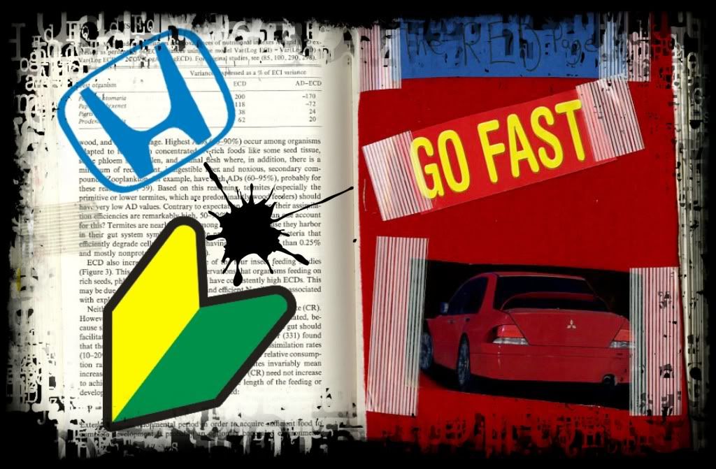
Poster #3
This is my poster number three. I decided to use one of my altered book pages from the workshop. I added a few things in it and added a typographic frame to make the poster look better, more of a grunge feel to it.

Online Artist #3: Jerico Santander
My third online artist is Jerico Santander. He does photo manipulation art. I found that photo manipulation can be very open to any type of design. I have seen some of his work and it is really clean. He likes to take different things from other objects and put into the main object. He mainly does people as his main object and he puts in different things like a machine or different types of objects. I find most of his work is somewhat dramatic. It is either dark colored picture or a sad looking one. When I look at his work. One of my favorite works from his website is the one with the man opening a shirt and a water fall is put onto his chest. I thought that was a cool effect. It was also clean because it looked like the person actually came out of the water. Then inside his chest is suppose to be the background but that one is really focused as oppose to the background outside his body.
I can relate to this artist very well. I like to change the photo around and manipulate them. I do it in a more of a comedic approach. I like to cut people out in other pictures and put them all in one picture. I think it is an interesting approach because you can trick a lot of people if it is done well.
http://www.behance.net/Jerico

Tuesday, March 16, 2010
Online Artist #2: Tyler Askew
Tyler Askew is a professional graphic designer. I have looked at his work and I think it is similar to the work that we do taking a picture and altering it with different designs. How Askew's work relates to mine is that I like to take pictures of people and alter it. I like to go into Photoshop and add textures and words in the picture to make it feel better. Some of his work is really simple but yet is very well done. If you put too much into a picture then it will be confusing. Tyler Askew does not do that. He takes a few textures and tries to connect it with the picture so that it will make sense and not be messy. I saw that a few of his works had grunge and that is something I like to work on. Most of the grunge is very interesting to me and when done right it can be a beautiful piece.
What inspires me about his work is his ability to keep it simple. When I do a graphic design piece, I always think "Less is more," as that is always true. Too much and the work can turn into disaster. His work is what I want to do in the future. He also works with typography which is also one of my favorite things to work on. I feel that typography art can be really strong even if you put one word on a piece of artwork.
Tyler Askew


Pictures from www.tyleraskew.com/
Wednesday, March 10, 2010
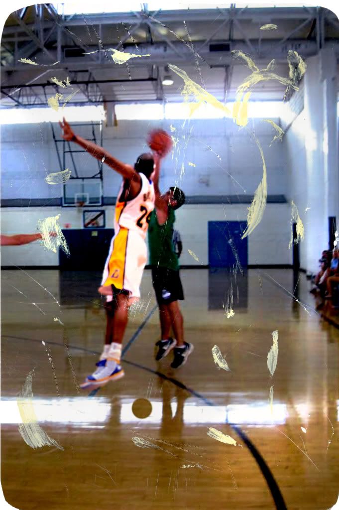
A few pages from my book.
Here are a few pages from my book. My books is going to be about manipulating sports pictures and adding other objects, people or anything else in my book.
Here are a few examples of what I am talking about:


Wednesday, March 3, 2010
Poster #2
I first manipulated this photo then I printed it out and did some stuff to it like scratch it, draw smudges on it and cut corners to make it look old. And then I scanned it into photoshop and used the dodge tool to give it an older from the 80's photo.
Poster #1
This is my poster number one. I made a composite picture and added a few things to it. As well as also adding some scanned stuff from my altered book that I made.

Wednesday, February 17, 2010


Thursday, February 4, 2010

Wednesday, February 3, 2010
Mark Bradford
Mark Bradford's type of art kind of surprised me. It was also kind of odd. He took street signs and altered them. It would be signs that were not from major companies. Most of the signs were either divorce signs, or finding certain paper's or even braiding ads. He would take those signs and colored them or altered them in a way of which he liked. The signs were from Los Angeles on a random fence. He created an art installation piece where he wanted to have that outside feel to it inside a room. I thought that was interesting because it kind of threw off the audience when they were looking at them. A sign would typically not be in the inside a room and be better off outside where people can see it. He just wanted to create some confusion in his piece.

Online Artist #1: David Carson
David Carson is a professional graphic designer. He does a lot of work with different companies making various logo's from soda companies to car companies. I have researched about this artist and how this artist relates to me is that he likes to do grunge type of art. Not only he experiments with just one color, black, he likes to experiment with different colors for grunge. I feel that grunge should not have this black color theme. It should be various colors. I like to have typography in my work and I greatly care about the type of typography I have and I try to make it look nice by having nice font's. David Carson has a lot of great typography work. He does a great job of incorporating both the typography and graphic design aspect all into one picture and not make his piece look very difficult to look at or in different directions. To me he does not confuse the audience in his work. I have looked at most of his work and it all seems to fit perfectly into what he is trying to portray. When the design seems to be really wild his typography will be wild too.
What inspires me is that he is not afraid of bringing in different textures and colors to help what he is trying to say about his works. Also his simplicity is what really gets to me. He can bring all of these elements in to his pieces but he can keep it simple by not doing too much.


What inspires me is that he is not afraid of bringing in different textures and colors to help what he is trying to say about his works. Also his simplicity is what really gets to me. He can bring all of these elements in to his pieces but he can keep it simple by not doing too much.


Wednesday, January 27, 2010
Barry McGee and Margaret Kilgallen
Both of these artist have very similar styles of art. Neither one of them like anything that is made on the computer as they feel that it is not real or handmade. Margaret describes the billboards or anything computer made as garbage. Most people would disagree and say that we are living in the future and anything handmade will take a long time. But not for the both of these artist. Kilgallen has this knack of using old school 16th century typography. It is her favorite type of typography because back then it was hand made and not made by a press or other devices. McGee loves to do street graffiti. I feel that street graffiti is property damage but to an artistic person it looks beautiful. Its is way different type of art from the regular art we see in a museum. Street art is more grungy and has for some reason more shine meaning that it sticks out more. Street artist love to tag anything. It can be really beautiful or it can be ugly but any form of it is considered art.
Thoughts on Linda Zacks
The artist that I have looked at is Linda Zacks. It is not the illustration that I am so much interested in but I am really interested in her works with putting real pictures and altering them herself and not use a computer. Her pictures that she alters looks like she used a computer to alter them. There was two books that I liked from her collection. The first book I looked at was Walk the Streets of Havana. It was pretty cool to see the different pictures of Havana and what it looks like. My favorite page was the third and fourth page of the book. The picture of the cities buildings in the morning. The picture itself is beautiful but when she altered it a bit she made the picture look old school or its been stored for a long time and it is showing signs of wear and tear. The pictures she took were very recent but when she puts them all together and alters them they look like they are pictures from the 70's especially with the old cars. The cars make it seem that the pictures were from 30-40 years ago.
Her other book that I looked at was Metal Worm. She had this grunge atmosphere in her books. Every page was dark and somewhat depressing. She put them together for a reason because it was for the viewers to try to solve what she is trying to say. As of right now I am trying to figure out what the message that she is trying to say. It seems like this is a depressed message.

Part One: 1000 Journals
So far the video is pretty good. 1000 journals is very interesting. He left them anywhere for people to randomly find and he shipped them off to random people that wanted them. At first I was thinking that would waste there time doing a journal for a guy. But as more and more people were interviewed that you can hand this off to anybody if you are done with what you have to do in your journal. It was kind of cool that people were able to meet for those who had journals. It was interesting to see all the types of things people did to the journal. I saw a variety of things from rubber bands to people actually doing artistic things to just simply writing something about everyday life. My favorite journal so far was the first journal from the lady that worked in the coffee shop. She put a lot of random things. It was as if the journal was recording her past till she couldn't record anymore because the pages ran out. The guy who made it (Someguy) wanted to see where in the world the book had gone too. There were people that felt really bad for giving the book away because they thought it was there responsiblity to get it back or they miss writing in it. It was the writers choice to keep it or give it away. If I were them I would keep it and record everything I would do. When Someguy got the journals back it is like as if he was reading there life story through a journal entry but really it was only a part of there lives.

Subscribe to:
Comments (Atom)